Sunday, August 1, 2010

BP14_Flash project expands to Dreamweaver


In trying to get a better understanding of how to utilize Flash in the building of my interactive interface of delivering my instructional content to my students so that they have control over the delivery I started to get deeper into the training of Flash by taking the Essential Training. While I was into it just a bit I came across the slide you see to the right and I started to wonder if I need to rethink how I was planning to use Flash. My new understanding is that I should be using Flash to create my instructional content but I should look to Dreamweaver to handle the delivery of that content.

So I looked into how that would happen in Dreamweaver and found that a lot of the controls and management features I was thinking of scripting in Flash are actually built into the Dreamweaver features. This is great because I now can focus on the more basic approach to developing instructional Flash content and then placing that into a website and have versatility in delivering that content. Dreamweaver and Flash were designed with that in mind. Flash is more for content creation and Dreamweaver is more for content delivery. So now I am training myself to learn Dreamweaver once again.

I first learned it about ten years ago when I created my first school website. It was easy to use and it was basic Web 1.0 design. Now as I started to investigate what it can do I am amazed at how much there is to learn. Since the advent of Web 2.0 tools, website design has taken on a whole new dimension in order to incorporate those tools into websites. So my work is cut out for me to create the content in Flash and deliver it through publishing it to HTML using Dreamweaver. This will make it possible to deliver through the web or self contain it on CDs.

I will continue to investigate this but I think it is safe to say that I can start creating content using Flash. Looking forward to the 6th month of FSO when do this. I have to get ready for it.

Saturday, July 31, 2010

BP13_Flash Training Update


After completing Lynda.com's course on Flash CS4 Professional Getting Started, I realized there is going to be quite a bit of work involved in setting up a Flash interface to deliver content to my students. Since I only completed the getting started course I first will move onto the essentials course since that will get into far more detail that I will require to develop the interface. However, the overview that I did get of Flash was very helpful in give me some basic ideas to work with. I would like to highlight those ideas and discuss how they will play a part in my interface for the remainder of this blog post.

The first thing I realized is I will have to create some graphics, sound and video to import into the Flash interface. So there will be much assets creation to make this happen. So the biggest focus will be on creating the interface to handle all of them. The areas I need to focus on are symbol creation, buttons and the action script in the timeline in order to make the navigation of the interface easy for students to use.

So with symbol creation I need to create visuals for the subjects that I am offering. I will need to break up the interface into easily identifiable areas that are consistent with all of the subjects I teach so that once the learning curve of using the interface has been mastered, students will be able to learn any subject using it. Also I see the need to create tabs that will offer various methods of instruction so that students have options on how their instruction in delivered to the multiple intelligence that they prefer.

The buttons that I require will be the controls for starting, stopping and moving to a specific area of instruction. Also there will be the selection lists for all the lessons and the problems within the lessons. Once these are worked out then a major part of the interface will be in place.

The most difficult part of the whole project will be writing the action script for managing the navigation for all the versatility that I want to be available to the student. I will need to develop some flow charts to keep this under control and make sure a logical process is developed. Once the logic and structure is designed I can then write the code I will use. I think the use of Gliffy will be helpful at this point.

Overall, I think Flash has a lot to offer but there is a big learning curve. My next post will focus on the beginning look of the interface.

Thursday, July 29, 2010

BP12_Practical Experience - Flash


One of the best examples of drill and practice methods of teaching math I have seen is the Teaching Textbook company and their use of neatly designed straight forward delivery of quick math lessons that the student can watch and control by stopping, fast-forwarding, or play again until understanding occurs. They also have plenty of examples along with the complete solutions to all problems worked out. The software they used to make this complete interface is Flash. That is why I want to learn Flash so I can develop an interface and lessons of delivery too. this is what I am going to attempt. If you would like to see for yourself an example of their product just click on this Teaching Textbook link.


Saturday, July 24, 2010

BP11_Celtx_OMM

I thought I should put some emphasis on the BP8_Celtx blogpost a few days ago and make an emotional appeal to the thought process I started there. The pictures are all from a CYT stage show of "Narnia the musical" which my children were in. The collection of pictures were taken by parents and all combined into one CD. The music is the "Curtain Call" which comes with Apple's iLife sound effects bundle for iMovie. And the screen shots of Celtx were taken using Screenflow.

Enjoy the commercial!


Thursday, July 22, 2010

BP10_Comment on LaDale Jacksons blog

LaDale Jackson blogged on a Web 2.0 tool that captures a website so you can make notes on it. I took a picture of my blog and commented on 3 areas just to try it out. Check out my comments to her blog by following this link

BP9_Comment on Brooke McKaig's blog


Sometimes you just want a video of an event in your life to remember it by but you don't have the time to put it together in a nice looking way. Or you have all these digital pictures that sit on a hard drive never to be seen. Just process them through Animoto and you have nice keepsake.

Brooke McKaig highlights two web 2.0 tools that do this.

Follow this link to my comment on her post.


BP8_Celtx


Something is missing! In the past four months, I have experienced the muses of creating engaging content through the exploration of multiple intelligences and brain-based learning. I have learned the vehicles of how to collaborate in the creative process of creating that content through many of the Web 2.0 software. When it comes to delivering the finished product we have ways of managing the content and keeping track of the record of accomplishment of the content through the CMS systems. But I just haven’t seen to my satisfaction a good explanation of the process of creating the content itself. Oh we have been busy at work doing it, which is obvious in the quality of work being presented, but I haven’t seen an articulation of the very process itself. For example, we witnessed an amazing process of creation in Wesch’s anthropology class of creating a world history from scratch through collaborative web tools and documenting the results through video production but we missed out on the underlying principles of direction. In other words, we saw the content development process but not the workflow essentials that drove and directed the process. To me it is essential to understand this process to complete the whole of what we are trying to achieve in redesigning our educational environments. This is where Celtx comes in.
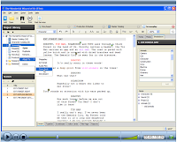
Celtx is a free software package that plans out the pre-production phase of creating media such as books, film, theatre, audio and comic books. It is designed to bring all available assets together in a well ordered and interconnected way so that the process of creation no longer has to be in a linear fashion as was once the process in creating such things as film (as an example) but now sound, visual, characters, actors, and all the other assets can be added in any order and other elements can now take on a more predominate role. As I explored the methods that they used in designing media using Celtx, I thought that this same process could be used to articulate the design process in the educational environment and we could manage the educational environment in the same manner. In other words, we found the missing piece to the puzzle.
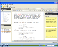
This is what Celtx offers. The center panel is like the stage that can be set for any type of media; film, audio-visual, theatre, audio plays, storyboard, comic book and text. On the top of the center panel there are tabs you can easily change the same content between the type choices depending on which way you want to develop it or if you are developing the media for multiple presentations which would meet MI needs. On the bottom of each tab there are more multiple tab choices for presenting the various outputs that are possible for that type. For example, the stageplay tab offers the script form, typeset, scratchpad, note cards, cast page and reports for sharing. Depending on what the center panel shows the side panels show relevant information such as available assets in the project library, segments of the project (scenes or sequences), notes, media and a breakdown of elements such as props, tech needs, sets and on and on. The neat function of this program is that you can drag and drop these assets from the side panels right into the script where they are needed and when reports are printed you have a comprehensive list of all that you need. Of course this can all be used in a collaborative effort because the files can be shared online with many editors with a built in chat feature.
By using software that directs the process of writing scripts for production of media, we can use it to write the lesson plans of the new paradigm of education. If we saw the students as the actors and the curriculum as the script; the teacher as the producer and the classroom environment procedures as the director; lesson plans as pre-production, lessons as the production, and assignments as post-production. Then using this analogy as the means to directing the workflow, I think utilizing the capabilities of Celtx to organize it all, then more teachers would be able to accomplish what Wesch was able to in his classroom. I may be way over the top on this. Tell me what you think.

I also encourage you to watch their videos that present the media creation process.

http://www.celtx.com/motionSketches.html

Saturday, July 17, 2010

BP7_OMM_Gliffy

See the organization!

Be the organization!

Feel the organization!


Gliffy


BP6_Comment to Orlando McLin's blog


Since the speed of technology advancements is at breakneck now a days, sometimes our heads get a little wobbly as we are on a constant look out for new technologies to excite our life. Of course this can set us up to find things that aren't actually true. The iPhone apps create such a craze. And what Star Wars fan wouldn't love to have a holographic message delivered to them just like Princess Leia delivered her's to Obwon. This is what is involved in Orlando McLin's blog post on the holographic text messaging app on iPhones.


Follow this link to my comment

BP5_Comment on Nereyda Valle's blog


Using social networking in education has some interesting implications. For example safety and staying on task. Nereyda Valle's blog post on Twiducate and it's benefits peaked my interest as to how it could be used in a positive manner. Follow this link to learn more.


BP4_Gliffy

When it comes to explaining complex information to students there is nothing better than graphic organizers in helping to make it clear to the student what is of most importance and how everything connects to each other. As a teacher, when I make a graphic organizer, I find it is very helpful to me personally that as I go through the process of making them the content I am working with becomes better understood. So if I am able to learn my own content to a greater extent while making a graphic organizer why not have my students take an active role in creating them so they too can learn to a deeper level. The only problem with this approach up to now was the time consuming mechanics involved in creating the organizers. Dealing with paper or whiteboard in the brainstorming stage is messy and if a mistake was made all the reorganizing was difficult. Then once the final draft was made from all the brainstorming and editing, you had to redo it so it would look presentable to others.


That is where Gliffy comes in. All the brainstorming and editing can be done online right from the start. All the elements you get from the available libraries have the neat and professional look from the start. You can move them around quite easily and any connections that were made between shapes in flow charts stay connected as you move. Everything is scalable to meet your size needs. You are able to collaborate on the files with others so that a student could be creating one on their own and the teacher could come in and make suggestions on how to improve or identify areas to work on. The best feature in completion is that it can be displayed in many different formats. You can export it to Visio, which is an expensive program for making graphic organizers, or to jpeg, xml, & png which make it easy to drop into other documents. Also you can print it to a pdf file that makes it easy to share or print.


So basically, this is a great Web 2.0 tool because of free online access for all to create organizers with ease and the ability to make changes on the fly and of course the feature to work with others in the creative process.


Saturday, July 3, 2010

BP3_Schoology

Twelve years ago when I left the classroom to go into the technology integration side of education, I said I wouldn’t come back until the technology would take care of the mundane side of teaching so I could spend more time on the instruction and curriculum design side. Five years ago, I came back to the classroom because I knew it was very close to that time when technology would just explode and meet all of those classroom management tasks (grading, grade keeping, data collection of instructional practices effectiveness, parent communication, etc.). Besides, the business of keeping the technology working had now become mundane due to endless software patches, hardware fixes and administrative lack of vision.

Well now it is here and I want to ride the wave. The technology hardware is putting out more users friendly, well integrated, sophisticated gadgets that allow you to complete many necessary tasks quickly and efficiently. The voluminous software apps has become so sophisticated, ubiquitous and collaborative that the possibilities of the educational applications are unfathomable. Ahhhhh, but to keep a handle on all of this with robust management means another software package that can organize, deliver and record the use of the curriculum is a must. That is why I picked Schoology as my Web 2.0 tool. It offers much potential in delivering the organization of curriculum while managing the specific assets and collecting grades and time spent on task.


Schoology also uses the familiarity of social networking interfaces, such as facebook, to make the ease of use for your students immediate. This is a great feature because of the sometimes-cumbersome use of Moodle, its closest competitor. They both are free and have extra features that can be paid for but are hardly necessary for someone just starting out. So I have signed up and plan on setting up courses for my students and explore the use of this in my classroom. From my initial look it is already more intuitive then Moodle and the organization is more streamlined. I’ll keep you posted on how useful it is.

Thursday, July 1, 2010

BP2_iGoogle Screen Shots


Personal Learning Environments (PLE) are key to effective learning. We all have them. Maybe it is that comfortable arm chair you like to curl up in to read a book. Or it is the desk with piles of books and paper that you can hide behind to get alone to get the creative energy flowing. Whatever it is to you, it is a place to relax, unwind, enjoy and have all the needed tools and comforts at your finger tips so the ease of learning is enhanced. Well, that is what iGoogle offers to us in a online personal learning environment tailored to your needs and comfort wants (I love looking at the chinese paper cuts). To the left is the Home tab of my iGoogle and it has what I need to have at my finger tips for work but also connections to friends and what is happening that I find interesting.


The FSO tab has what I need to connect quickly to the links and tools to do the work of learning.


The AR/CBL tab is for organizing my research and keeping me on task.


Finally, the ETC tab helps to stay focused on the essentials of the fast paced month of learning that comes along with every Full Sail University course. While modeling the very technologies that are taught in the course, the Emergent Technologies in a Collaborative Culture class uses iGoogle to challenge it's students to think of new ways to organize and work in new and creative ways. I'm ready to go.

BP1_Google Reader

When it comes to math modeling there is always a need to establish the variables that will be explored and the constants that bring constraints. When it comes to exploring all the possibilities available to math education through the use of media and technology, it is important to have those constants of other math teachers and educators to keep you grounded. So that is why my Google Reader highlights four math blogs that I subscribe to. This is so I keep in touch with my colleagues' insight and activities so as to sharpen my own endeavors. The four I picked are as follows:
Now to keep it more on the cutting edge and to add variability in the mix of modeling good math education, I chose three other feeds that are presenting technology that needs to be explored to it's fullest so keeping a finger on the pulse of what is happening at these companies is very important. They are:
  • Livescribe Blog - the pen and software are great to work with and I need to see how others are using them and what is the latest developments.
  • Teachers Love SMART Boards - Shows the many ways this technology can be used and they are adding more gadgets to the mix.
  • TI cares - Is a collection of teacher added lesson plans complete with supporting calculator files that can be downloaded for use by any one that has the TI calculators.
The final blog is for great communication skills and humor. One of my favorites for a long time. Ken Davis Productions mixes humor, faith, life and the ability to tell a story well. I always learn from him.